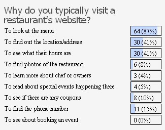
Well, the results are in.
I spend a lot of time on restaurant websites as you can imagine. There seem to be two genres of restaurant sites: one flashy, the other amateurish. By flashy I mean literally created with Flash, as well as the assumption that the first thing people want to see is a “loading” status bar when they visit the site. I want information, not eye candy. I want interior URLs I can link to and text I can copy and paste.
Amateurish sites are probably created by restaurant owners or friends of the owners rather than professional firms. They have their own set of problems particularly when they are wrought with web 1.0 craziness like Governor Stumpy’s original site (tip o’ the cap to @sjwaters & c_giffin).
So, what should the restaurant home page have on it?
The address (preferably with a link to a map), the hours and a link to the menu. Please. For cryin’ out loud.
It’s amazing how many sites bury their hours under ‘About Us’ or ‘Contact.’ This information is fundafuckinmental to whether or not people will show up. And people are stupid and pressed for time.
And in a metro area where Parkville and Lee’s Summit can all be referred to as ‘Kansas City,’ it is pretty important to know where a place is located before anything else. In fact, I’d venture to say that for lunch, location is the single most important determining factor in making a choice of restaurant. So, yeah, let’s just bury the goddamn address under ‘More Info’ or something. Or the footer.
But what I really want to talk about are menus on restaurant websites. It is extremely common to see menus available solely as PDF documents. Despite its ubiquity, PDF is not a web-friendly format and is better suited to documents that will be printed out or saved by the user. As someone who has dealt extensively with the public using technology, many people simply avoid PDFs as a rule of thmub. Others still are confused by them when they get hung up loading or when Adobe wants to update.
As the inarguable results of my methodologically sound poll suggest, menus are the number one thing people want to see on a restaurant site. If your business is food, that food needs to be front and center. Restaurants need to provide menu right on their web pages. In HTML. Linked from the front page.
Yes, it will take more effort and skill to update a website continually, but the Web is not a static medium. If restaurants think they can develop a site and leave it alone, they are doing it wrong. The Web is probably the biggest way people find out about places to eat. There is no shortage of review sites like Urbanspoon and Yelp, not mention blogging dumbasses with opinions like myself. The job of a website is to serve the needs of someone who might only spend 2 seconds on your site. A restaurant’s website is its public face, like it or not. It should be fast, inviting, efficient and clean, just like the restaurant itself.

Hate PDF. They are only above the a-holes who put up files in MS Word. Luckily Acrobat is now a little faster, in the olden days of dialup I had enough time to get a smoke before it opened up.
Thank you for this post. It drives me absolutely nuts how many places do not have this most basic of information online.
You want me to come to your restaurant? I need to be able to see your menu so I know if you have anything I want to eat and if it’s in my price range.
You want me to come to your restaurant? I have to be able to see your hours so that I know that if I go out of my way to visit you will even be open.
(Oh, and a hint for new places and for struggling locally owned places: once you post your hours, STICK TO THEM. If you close early any time it’s slow, it trains potential customers that they can’t rely on you being open and they WILL just go elsewhere.)
The same could be said for bars as well.
I think your point is especially relevant in a world that’s seen a massive increase in “food issues” like gluten-intolerance, vegetarian-ism, over-healthy-eating-ism, etc.
Great post.
Check out this beauty… http://www.westportcoffeehouse.com/
Couldn’t agree more. If I am looking for restaurant info on my phone (which is very common) and your site is a Flash site, I’m not going to get the info I need and probably wont be going there. Same thing with PDF. Very cumbersome on a phone.
Thanks everyone. Chris, that wesport coffee house site is a real piece of work! You have inspired me to start compiling a list of Kansas City’s worst restaurant websites. Anyone have nominees? Send them my way!
To be fair, I am one of the most irrational people I know – but I have blacklisted many a restaurant over their website. The only thing worse than the PDF menu is the flash menu. If Minsky’s Pizza (minskys.com) did not have the Prime Cut they would be dead to me. But bacon topped pizza has a away of soothing my anger.